To run a successful online store, you not only have to attract the right audience to your site – you have to capture their attention and persuade them to purchase.
One key indicator of your site’s performance in this area is its bounce rate.
What is bounce rate?
Bounce rate is the percentage of people who land on a page of your site and then leave without visiting any other pages. This metric can tell you a lot about how well your site is doing in engaging potential customers. If your bounce rate is really high, it could be a clear indication that you’re not doing a good job capturing their attention, which means you have a much lower chance of persuading them to purchase.
What is a good bounce rate?
There is no set rule for qualifying a “good” or “bad” bounce rate. Some experts like Neil Patel report that average bounce rates vary between 45-65% across all industries. Hubspot lists bounce rates by industry benchmarks compiled by Google. According to them, the average eCommerce bounce rate should fall between 20-40%.
Logic would say that a good bounce rate would be one that is within or below that average.
However, to improve your site, focus less on comparing your bounce rate to industry benchmarks or other websites, and instead focus on comparing your bounce rates to your own previous performance.
In other words, a good bounce rate is one that is lower than the previous period you’re measuring (month, quarter, year, etc).

How do you find your bounce rate?
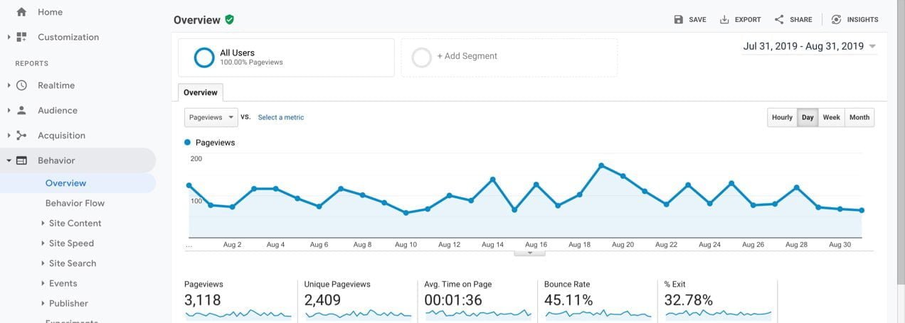
Bounce rate is usually displayed at the top of the first page when you log into Google Analytics, or if you navigate to Audience > Overview. But, this number is the sitewide bounce rate for a default period of time and won’t tell you much.
If you go to Behavior > Site Content > All Pages, you’ll find the bounce rate for every individual page on your site. You can adjust the time period in the upper right corner.
The WooCommerce Google Analytics Pro extension provides a great way to view detailed analytics from your online store. This extension will help you see the connection between your analytics data and actual sales so that you can make key decisions to improve your revenue.
How should you measure bounce rates?
You should measure bounce rates against a time period with a sufficient sample size or between two substantial events. So, you might look at bounce rates for this month vs. the same month in the previous year. Or, if you just launched a redesigned site, you may compare the first month after the launch to the month before the launch.
Imagine spending money on an ad that sends ten people to your site, but none of them make a purchase. That small of a sample size should not lead you to make a major change as it’s simply not enough data to determine a trend.
Usually, it’s wise to stay away from making decisions based on day-to-day bounce rates because any one day can experience an anomaly that throws your data off. However, this could make sense in certain situations. If you have a single event each year that makes up a large portion of your sales, you might want to do a single day comparison of this year’s event date vs. last year’s.
One reason you may still want to monitor day-to-day bounce rates is not to make determinations about major changes to the site, but to spot any problems. If you normally see a bounce rate of 35% and then one day it spikes to 90%, you’ll want to investigate further. It could be that something is broken on your site.
Finally, beyond the sample size or time period you use to measure bounce rate, consider exactly what you’re measuring. Individual pages may have unusually high or low bounce rates or you may see certain categories of pages perform better as a group than others. By analyzing pages individually or in coordinated groups, instead of only looking at your site-wide bounce rate, you can learn what pages or types of content engage your customers and what do not.
So, why do people bounce?
People bounce for numerous reasons, but it usually has to do with one of these four broad areas:
1. You aren’t attracting the right kind of visitors. If you are running ads targeting high-end luxury shoppers but your site is selling discounted bulk bargain items, even if you have a perfectly designed site, you’re going to see an unacceptable bounce rate.
2. You didn’t compel them to go any further. There was nothing engaging or interesting enough for them to continue browsing your site. Even a perfectly-targeted audience will leave if the message on the page doesn’t resonate with them.
3. There was a poor user experience. Perhaps your site took too long to load, or your users couldn’t read the text on your site. Maybe they received a malware alert or saw something else that made them feel unsafe. If they were browsing on a mobile device and your site wasn’t optimized for mobile, they may have moved on. If your menu was hard to navigate and they couldn’t figure out where to go, they may also have left.
4. You provided exactly what they were looking for. A specific page of your site that has a particularly high bounce rate does not always mean that it needs to be redesigned. In fact, it could mean that it’s wildly successful in providing value to the user. How?
Imagine your customers search for “What size shoes does [example store] sell?” They click on the first search result and it goes to a page on your store that says you sell women’s shoes in sizes 3-11. The person gets their answer, files that information away for future shopping, and leaves. You answered their question quickly and effectively and added value to their experience. They left without viewing any other pages, but that doesn’t mean it was a failure.
You should always think about the full context of the user experience and your marketing goals when you consider bounce rate.

What can you do to improve your bounce rate?
1. Get Technical
Users expect your site to load quickly. They expect that it will conform to the device they’re using and that they can navigate it effectively. They’ve also been trained to look for signs of legitimacy such as an SSL certificate or industry endorsements.
According to Entrepreneur.com, 47% of users expect a site to load in two seconds or less. It’s a good idea to run some speed tests and see how your site is performing. Does your site consistently meet this threshold? Often the culprit of slow-loading pages for an eCommerce site is a lack of properly-optimized images. Jetpack is one easy way to help optimize your images, but you can also read our full guide here.
Is your site mobile-friendly? More visitors now browse on mobile devices than ever before, and the percentage is growing daily. If your site is hard to navigate on a mobile device, you greatly increase the chances that your visitors leave without viewing any additional pages.
You can use Google’s mobile-friendly test to see how well your site measures up along with suggestions for improving it.
Get an SSL certificate and make sure that any unresolved malware issues you may have had in the past are completely resolved. If users get to your site and receive a virus/malware warning, you can bet they won’t stick around long.
2. Limit Distractions
In the age of GDPR, first-time visitors to your site are usually greeted with a notice and request for permissions on their screen. If you immediately accompany that notice with a pop-up, chat box, or something else that gets in the way of navigation, customers can become annoyed.
If you have numerous ads on your page, multiple offers flashing, pop-ups and general clutter, it’s like walking into a physical store and being greeted by several pushy salesman at the same time. It can make the experience uncomfortable and cause customers to leave.
So, limit your use of these kinds of tools. Test each one to see how it impacts your bounce rate and sales and optimize the user experience according to what provides the best results. You could run a pop-up every other week and see if there’s a measurable impact on sales or bounce rates. Do the same for chat bots or other tools. And remember, these tools may be worth a higher bounce rate if the increase in sales far outweighs the lost visitors.
3. Create Easy Navigation
If you offer a wide variety of product categories, make sure the options are presented clearly and quickly. If you sell t-shirts, shoes, and pants but all you have showing when a user goes to your site is t-shirts, they may get confused or frustrated and leave. Immediately give them the broad categories to choose from and let them pick their path from there.
Items in your menu should be short, concise and clearly describe the exact page they’re linking to. Avoid using niche terms or lingo in your menu, as a first-time visitor may not understand what they mean.
Sticky menus can be great for long pages so that users don’t have to scroll all the way to the top to access your main menu. Customers expect to find things like contact information, FAQs, and policies in your footer.
Finally, if your site contains a lot of complicated information or pages, you may want to consider adding breadcrumbs. These provide a secondary way for users to navigate your site and easily get back to the page they were on previously. They also outline the hierarchy of your site and keep visitors from getting lost.

4. Put Your Best Stuff Above the Fold
The term “above the fold” comes from newspapers. Newspapers sit on a rack and all you can see is the top half – what appears before they’re folded over. That top half has to draw you in immediately. If the attention-grabbing headline is at the bottom, you won’t see it or want to pick it up.
On a website, “above the fold” refers to what is visible to the user without having to scroll or navigate. What appears above the fold will be different on various devices and screen sizes. Test as many sizes as possible to make sure you grab attention right away. Depending on where you place notices for things like GDPR, this may not always be at the very top of the page.
Pro Tip: Use Google Analytics to see what screen sizes/devices are responsible for the majority of your website traffic. There are hundreds of devices and screen sizes, but a small number likely make up most of your traffic. Since you may not be able to test and adjust to all of them, pick the most important ones and get those right first.
You might have to sacrifice the user experience for a device that brings 1% of your traffic in order to improve the experience for a device that brings in 50%.
5. Always Be Testing
If you’re not sure how something on your site will affect bounce rate, or if you want to refine small changes to maximize their impact, you may want to consider A/B or split testing. These kinds of tests allow you to send traffic to alternate versions of your website or a particular page. They then send you data about overall performance.
For example, you may choose to test two variations of banner images at the top of the site. You can run this for a period of time and see if version “A” or version “B” result in a lower bounce rate.
Here’s a great A/B testing tool to consider.
6. Get Users to the Right Place the First Time
Use SEO to optimize pages based on categories so that people don’t just land on your home page, they land on the page that offers exactly the category of products they’re looking for. If someone searches “[example brand name] shoes”, you ideally want your main shoes category to show up first, not your store’s home page. If you need some help, Jetpack provides some great tools to assist with your SEO goals.
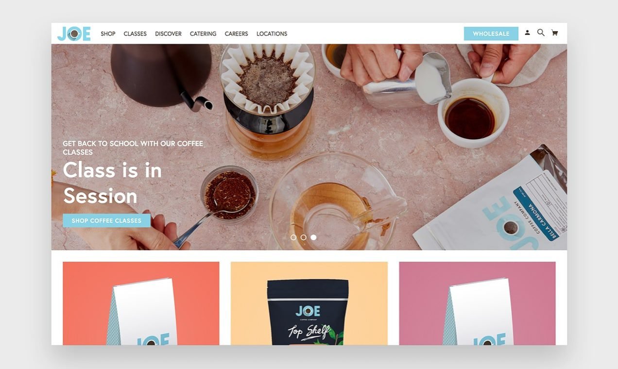
With paid search ads, you can add site links that take users to a specific page on your site. If you sell merchandise geared towards students, you may run an ad that shows up when someone searches “back to school clothes”. A user can click the headline of your ad and be directed to a landing page for your back to school sale, or you can separate categories of merchandise into sitelinks so users can more quickly find exactly what they’re looking for.
You may have site links for “Backpacks”, “Uniforms”, “Athletic Clothes” and “Shoes”. Users may search “back to school clothes” but really be looking for uniform wear. If they get directly to your uniforms section the first time, they’re much more likely to be satisfied by what they see and continue to browse your site.
These same kind of sitelinks may also appear in organic search results. While you can’t dictate exactly what links show in the results, Google suggests some best practices to help in your effort.
7. Have High-Quality, Unique Images
High-quality images are crucial to the success of your online store. Since users can’t see and hold the products in person, you want to make the experience as realistic as possible.
Stock photos may seem like a good idea, and in some cases they are, but stock photos that any other store may also use don’t help you establish a unique brand. Try creating a consistent look that users will recognize and appreciate as authentic and unique to you. This may involve using specific filters on all of your photos or featuring models in a consistent setting.
Consider using images that include people instead of products on a plain background. A Georgia Tech study found that images on Instagram that included people in them were nearly 40% more likely to garner reactions from users. These kinds of pictures help visitors better envision themselves wearing or using your products. It’s a more inviting and personal experience, just like shopping at a local boutique instead of a massive warehouse with boxes of products.
8. Accessibility and Readability
The users that visit your site are unique and varied. They have individualized needs and, by catering to those, you’ll be able to keep more people on your site for a longer period of time.
Make sure your site is accessible for those with disabilities. View our accessibility guide here.

9. Show Authority and Legitimacy
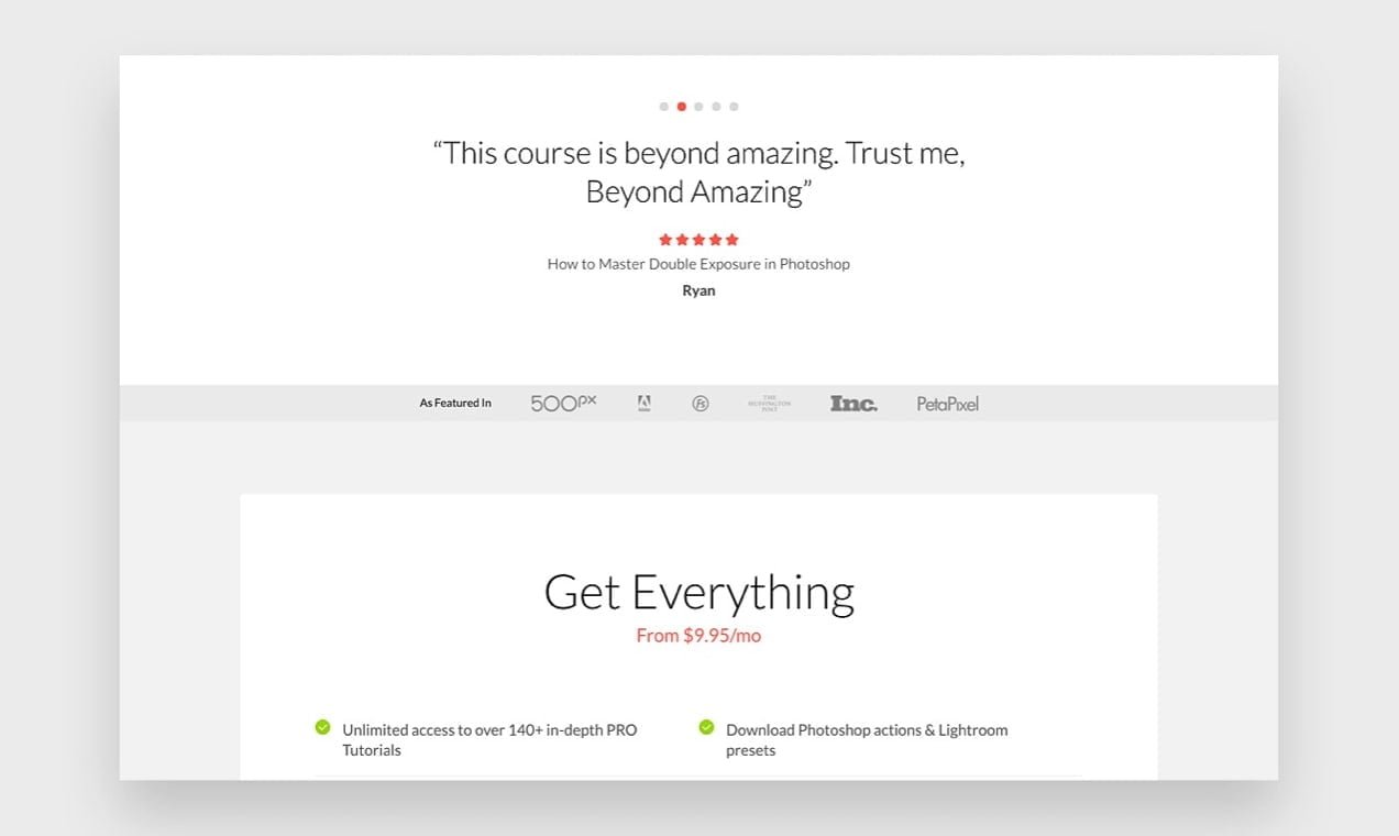
Do you ever wonder why products often feature the “as seen on TV” logo on their packaging? Or why wine bottles will list the awards or ratings the wine has received? It adds a sense of legitimacy to what they’re selling. If your product has been featured on a notable program or media site, or if you’ve won an award or accreditation from an industry organization, include this on your website to help users understand the value of your product.
10. After the Bounce
Despite your best efforts, some people will still leave your site without visiting any other pages.
And, even if they don’t bounce, most people won’t make a purchase on their first visit. You can reach out to these people with remarketing ads that are customized based on what pages they visited. Read our guide on how bring back potential customers.
If you have a high bounce rate, these efforts can help minimize its negative impact while you work to resolve it.
Start Measuring, Start Improving
Bounce rate is one of many valuable metrics you can use to monitor the success of your site and improve it over time. While it’s not the only thing you should focus on, steady improvement to your bounce rate through careful measurement and experimentation over time can greatly improve the profitability of your site.
Make sure you always think of your bounce rate in context of the time period you measure and what page you’re measuring. Focus on improvement over time, rather than a comparison with other sites.

