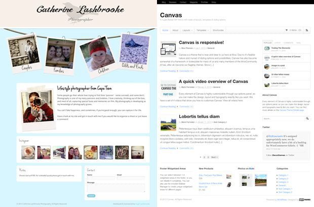
Building a photography website that stands out from all the others of its ilk can be a tough thing to do these days – that’s why, when my wife needed a new website built, I spent ages trying to work out how to make it special. In the end, she conceptualised and designed it herself and I simply implemented her ideas. The result is something unique and memorable that was only made possible by using a few of the awesome tools that we provide at WooThemes.

Capitalising on Canvas
As a developer, when building a custom-designed website in WordPress, its pretty much a no-brainer to pick Canvas as your base theme – given its assortment of hooks and filters. This is exactly what I did here and I handled all the customisations using a child theme that I set up.
The design of the home page required a fairly creative use of CSS and images to get things looking just right – to achieve the ‘hanging’ polaroids effect I made good use of CSS positioning and the transform property to handle the rotation of each mini-slider, choosing to apply the CSS to the parent element of each one so that each child element was rotated to the exact same degree.
Here’s an example of the use of CSS position and transform on one of the sliders:
#polaroid {
  position: absolute;
  top: 55px;
  left: 44px;
  transform: rotate(-10deg);
  -webkit-transform: rotate(-10deg);
  -ms-transform: rotate(-10deg);
  -moz-transform: rotate(-10deg);
  -o-transform: rotate(-10deg);
  filter: progid:DXImageTransform.Microsoft.BasicImage(rotation=1.5);
}

The portfolio functionality of Canvas was entirely suitable for the site’s needs – I simply made some CSS changes as well as some large modifications to the layout of the individual shoot pages using a masonry layout powered by the Isotope jQuery library.
Working with WooSlider
WooSlider is exceptionally powerful and incredibly easy to customise, as I discovered when working on this site. To create the homepage sliders, I followed our guide on using the WooSlider API and created my own custom slide type that displays images exactly how I need them to be displayed.
My major concern with doing this was that having four sliders on the home page of the site would drastically increase page load times, but in the end I had nothing to worry about as WooSlider allows you to have as many sliders on one page as you like without affecting the overall load times.
Integrating Instagram
Because this is a photography site, it made sense to integrate Instagram to some degree. Luckily, WooDojo comes with a built-in Instagram widget for easily displaying your photos. All I needed to do was modify the default CSS provided by WooDojo and it was good to go. So simple.

Lightening the Load
With any photography site, there is a concern about constantly loading large images and how that will affect the user experience. On this site, there are two main areas where a large number of images are loaded and they all need to be loaded quickly: the home page sliders and the individual shoot pages. Fortunately, the image sizes for both of these areas are not huge, so the only issue is that there are quite a few that need to be loaded on each page.
To deal with this I created two new image sizes using WordPress’ add_image_size() function and used the WooFramework’s woo_image() function to display them appropriately. The result is that all the images loaded are sized correctly on the server so that there is no unnecessary excess loading performed.
#WooFTW
While there are other tools out there that could potentially be used to create the same effects, I found the combination of Canvas, WooSlider and WooDojo to be an incredibly powerful mix. Without the huge potential for customisation that these tools provide it would have been exponentially more difficult to realise a site like this one.
Visit catherinelashbrooke.com

